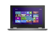
 GL551JM 15-Inch Gaming Laptop
$320.20
GL551JM 15-Inch Gaming Laptop
$320.20
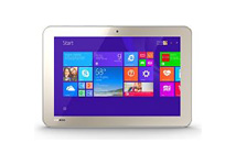 Encore 2 WT10-A32 10.0
$110.40
Encore 2 WT10-A32 10.0
$110.40
Basic example
For basic styling—light padding and only horizontal dividers—add the base class .table to any <table>. It may seem super redundant, but given the widespread use of tables for other plugins like calendars and date pickers, we've opted to isolate our custom table styles.
| # | First Name | Last Name | Username |
|---|---|---|---|
| 1 | Mark | Otto | @mdo |
| 2 | Jacob | Thornton | @fat |
| 3 | Larry | the Bird |
<table class="table">
                      ...
                    </table>
Striped rows
Use .table-striped to add zebra-striping to any table row within the <tbody>.
Cross-browser compatibility
Striped tables are styled via the :nth-child CSS selector, which is not available in Internet Explorer 8.
| # | First Name | Last Name | Username |
|---|---|---|---|
| 1 | Mark | Otto | @mdo |
| 2 | Jacob | Thornton | @fat |
| 3 | Larry | the Bird |
<table class="table table-striped">
                      ...
                    </table>
Bordered table
Add .table-bordered for borders on all sides of the table and cells.
| # | First Name | Last Name | Username |
|---|---|---|---|
| 1 | Mark | Otto | @mdo |
| 2 | Jacob | Thornton | @fat |
| 3 | Larry | the Bird |
<table class="table table-bordered">
                      ...
                    </table>
Hover rows
Add .table-hover to enable a hover state on table rows within a <tbody>.
| # | First Name | Last Name | Username |
|---|---|---|---|
| 1 | Mark | Otto | @mdo |
| 2 | Jacob | Thornton | @fat |
| 3 | Larry | the Bird |
<table class="table table-hover">
                      ...
                    </table>
Condensed table
Add .table-condensed to make tables more compact by cutting cell padding in half.
| # | First Name | Last Name | Username |
|---|---|---|---|
| 1 | Mark | Otto | @mdo |
| 2 | Jacob | Thornton | @fat |
| 3 | Larry the Bird | ||
<table class="table table-condensed">
                      ...
                    </table>
Contextual classes
Use contextual classes to color table rows or individual cells.
| Class | Description |
|---|---|
.active
|
Applies the hover color to a particular row or cell |
.success
|
Indicates a successful or positive action |
.info
|
Indicates a neutral informative change or action |
.warning
|
Indicates a warning that might need attention |
.danger
|
Indicates a dangerous or potentially negative action |
| # | Column heading | Column heading | Column heading |
|---|---|---|---|
| 1 | Column content | Column content | Column content |
| 2 | Column content | Column content | Column content |
| 3 | Column content | Column content | Column content |
| 4 | Column content | Column content | Column content |
| 5 | Column content | Column content | Column content |
| 6 | Column content | Column content | Column content |
| 7 | Column content | Column content | Column content |
| 8 | Column content | Column content | Column content |
| 9 | Column content | Column content | Column content |
<!-- On rows -->
                    <tr class="active">...</tr>
                    <tr class="success">...</tr>
                    <tr class="warning">...</tr>
                    <tr class="danger">...</tr>
                    <tr class="info">...</tr>

                    <!-- On cells (`td` or `th`) -->
                    <tr>
                      <td class="active">...</td>
                      <td class="success">...</td>
                      <td class="warning">...</td>
                      <td class="danger">...</td>
                      <td class="info">...</td>
                    </tr>
Conveying meaning to assistive technologies
Using color to add meaning to a table row or individual cell only provides a visual indication, which will not be conveyed to users of assistive technologies – such as screen readers. Ensure that information denoted by the color is either obvious from the content itself (the visible text in the relevant table row/cell), or is included through alternative means, such as additional text hidden with the .sr-only class.
Responsive tables
Create responsive tables by wrapping any .table in .table-responsive to make them scroll horizontally on small devices (under 768px). When viewing on anything larger than 768px wide, you will not see any difference in these tables.
Vertical clipping/truncation
Responsive tables make use of overflow-y: hidden, which clips off any content that goes beyond the bottom or top edges of the table. In particular, this can clip off dropdown menus and other third-party widgets.
Firefox and fieldsets
Firefox has some awkward fieldset styling involving width that interferes with the responsive table. This cannot be overriden without a Firefox-specific hack that we don't provide in Bootstrap:
@-moz-document url-prefix() {
                      fieldset { display: table-cell; }
                    }
For more information, read this Stack Overflow answer.
| # | Table heading | Table heading | Table heading | Table heading | Table heading | Table heading |
|---|---|---|---|---|---|---|
| 1 | Table cell | Table cell | Table cell | Table cell | Table cell | Table cell |
| 2 | Table cell | Table cell | Table cell | Table cell | Table cell | Table cell |
| 3 | Table cell | Table cell | Table cell | Table cell | Table cell | Table cell |
<div class="table-responsive">
                      <table class="table">
                        ...
                      </table>
                    </div>